Rational
The name “Evoke” for the art gallery is intended to inspire emotional resonance through its exhibitions. Choosing this name aims to create a deep connection between the audience and the displayed artworks, stimulating their imagination and emotional response. Evoke seeks to evoke thoughtful appreciation and discovery of the intrinsic value and beauty of art through its diverse artistic expressions.
Idea and Concept
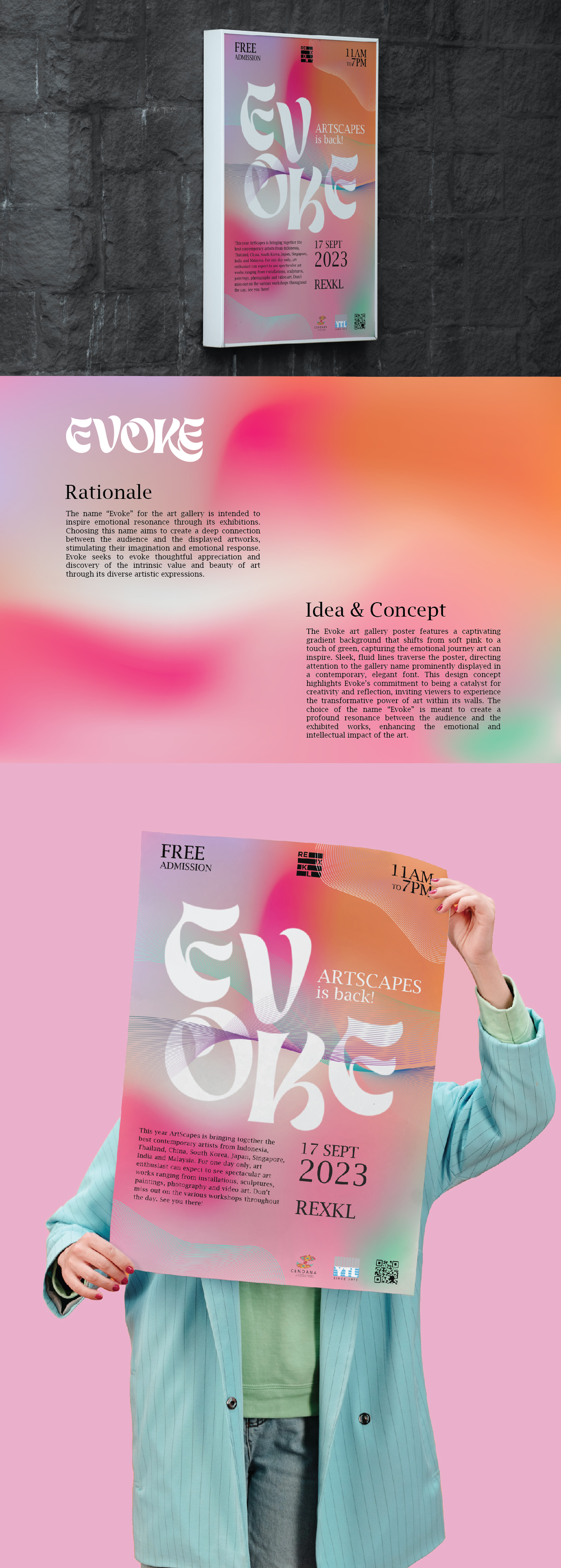
The Evoke art gallery poster features a captivating gradient background that shifts from soft pink to a touch of green, capturing the emotional journey art can inspire. Sleek, fluid lines traverse the poster, directing attention to the gallery name prominently displayed in a contemporary, elegant font. This design concept highlights Evoke’s commitment to being a catalyst for creativity and reflection, inviting viewers to experience the transformative power of art within its walls.
The choice of the name “Evoke” is meant to create a profound resonance between the audience and the exhibited works,
enhancing the emotional and intellectual impact of the art.